Your Custom Text Here
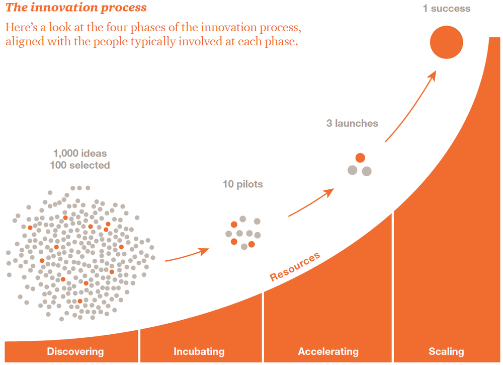
Some charts just tell a story, using numbers just as an illustration. In this chart, I showed a process of refining an idea from 1,000 possibilities down (or up) to one.
In addition to showing the number of ideas, the curve on the bottom creates a strong feeling, a mood, of how much more resources are needed to implement the idea.
This graphic was created for PwC.com